Ernesto Zuazo
Product Designer

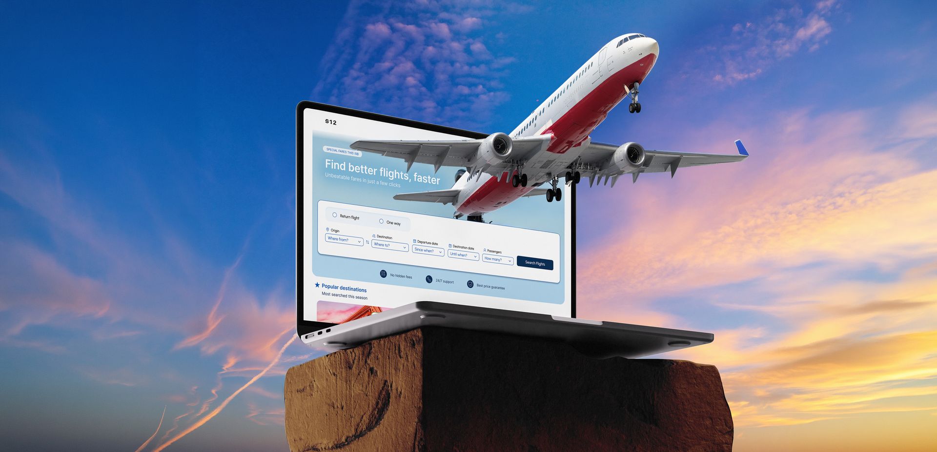
Flight Booking Web UX/UI
Show more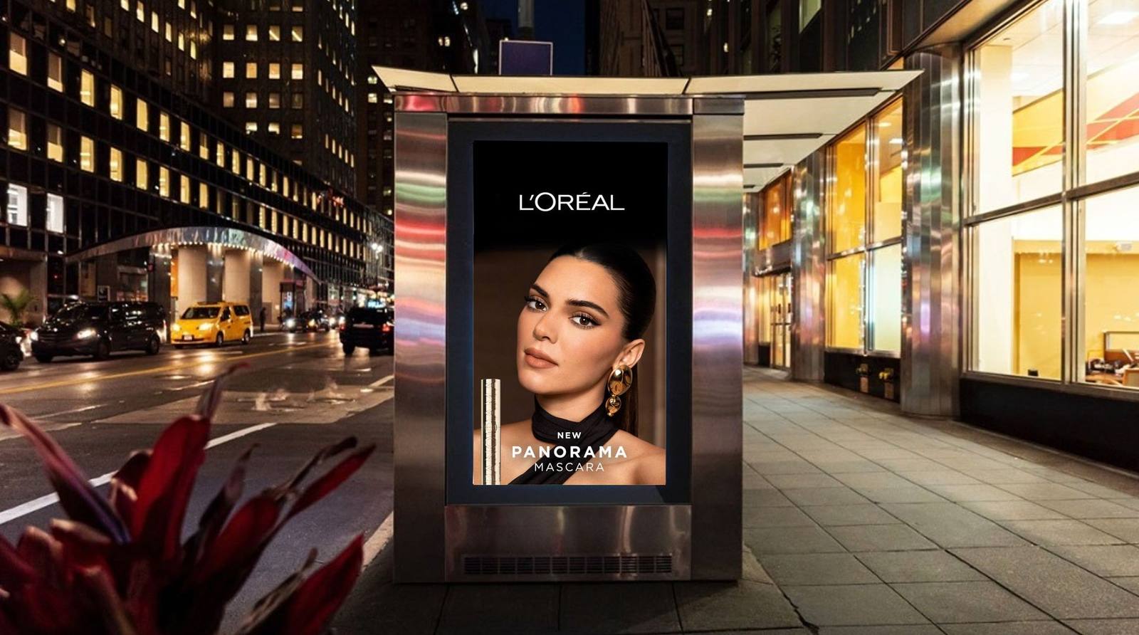
L'Oréal Motion Production
Show more







Ernesto Zuazo
Product Designer
Redesigning complex products into intuitive experiences
I design meaningful digital products with a strong visual foundation and a growing UX focus. I bring a system-driven approach to balance aesthetics, usability and real impact.




















UX/UI
UX Research & Product Design
End-to-end UX process: discovery research, user interviews, competitive analysis, wireframes and high-fidelity prototype.
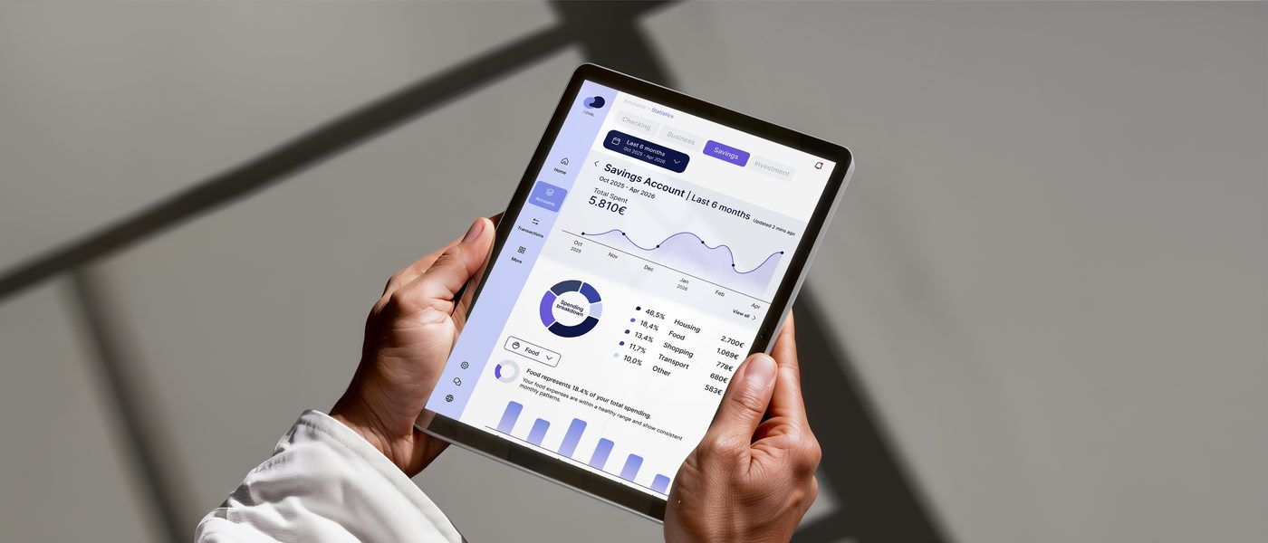
Banking App — UX/UI Design
A mobile banking application designed to make personal finance management clear, engaging and trustworthy. The project covers the full UX/UI process: competitor analysis, reference research, wireframes and high-fidelity screens. Focus on data visualisation, intuitive navigation and user confidence.
Flight Booking — UX Research & Design
End-to-end UX research and redesign of a flight booking flow. From moderated usability tests on live products to high-fidelity screens, grounded entirely in what real users did and said.
Flight booking is one of the most studied flows in UX and still one of the most broken. Hidden fees that appear at checkout. Fare tier names that mean nothing without reading the fine print. Pre-checked insurance boxes. Seat maps that are impossible to read on mobile. Forms with no progress indicator and no way to go back without losing everything.
The brief was not to redesign a brand but to redesign a booking experience: one that respects the user's time and intelligence, gives them control at every step and builds enough trust that they feel confident, not anxious, when they hit Pay.
The project started with 3 moderated usability tests on two live booking flows, Ryanair and Iberia, producing over 180 raw observations. Those notes were clustered into 13 affinity themes through manual mapping, then processed with AI-assisted sentiment and keyword analysis to set priorities quickly without losing depth. From there: a journey map across 8 stages to make the full emotional arc visible, followed by 51 pages of paper sketches before opening Figma. A second round of 2 usability tests on the medium-fidelity wireframe caught interaction issues. Seat map confusion, missed baggage return leg and payment form anxiety before committing to high fidelity.
To understand where existing booking flows fail, I conducted 3 moderated usability tests across two airline websites: Ryanair and Iberia. Each participant completed a realistic booking task on both sites while thinking aloud, allowing me to capture friction points, hesitations and mental models in real time. Across 6 sessions I logged over 180 individual observations. The raw material for everything that followed.
With all raw notes collected, I ran an affinity mapping session to cluster observations into meaningful themes. Each sticky note was sorted bottom-up, grouping by similarity until patterns emerged naturally, resulting in 13 thematic clusters such as "Frustrates the user", "Feels confusing", "How user chooses their seats" or "Reactions to travel insurance". This made shared pain points and behavioural tendencies visible across all 3 participants.
To go beyond manual grouping, I used AI to run two additional passes over the full dataset of notes. A sentiment analysis classified each observation as Positive, Neutral or Negative, revealing that the majority of interactions generated neutral-to-negative reactions. A keyword extraction then surfaced the most frequently referenced concepts (baggage, seat selection, payment, calendar, travel insurance…), helping prioritise which parts of the flow needed the most attention in the redesign.
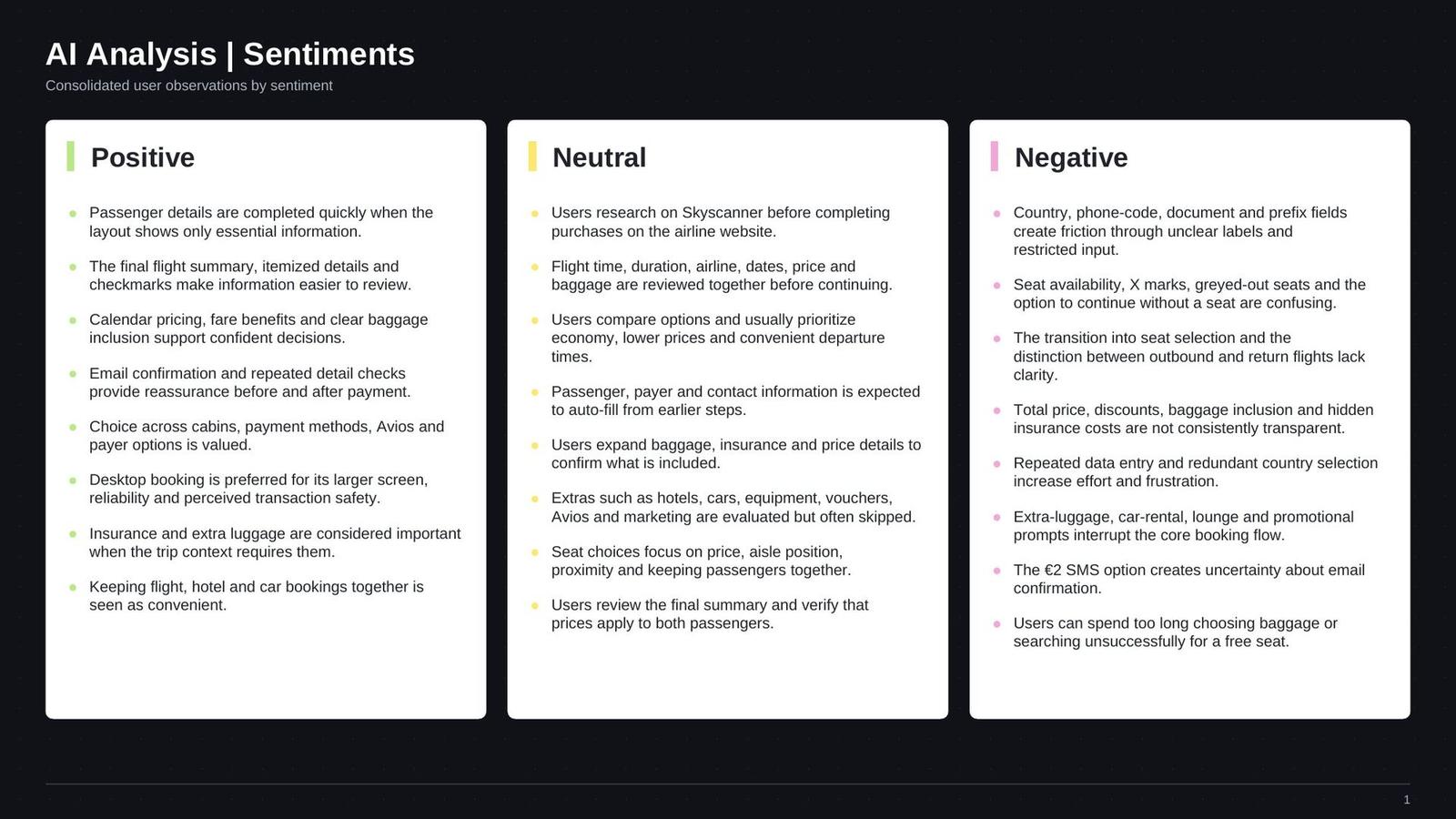
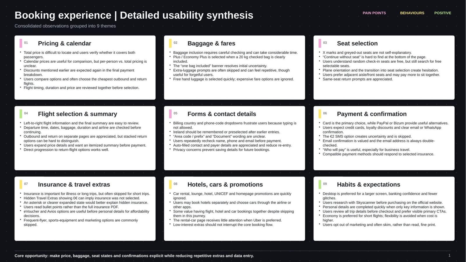
Drawing from all the research, I built a user journey map to visualise the end-to-end booking experience from the user's perspective. The map traces 8 stages, from previous research through to payment & confirmation, documenting context, goals, behaviours and pain points at each step. An emotion curve was added to show how the user's confidence and satisfaction shifted across the flow, making it immediately clear where the experience breaks down.
research
compare
selection
details
selection
insurance
Before touching Figma I work out the core interactions on paper. The 51-page sketch sequence shown here is one continuous user session: from landing to payment confirmation.
The low fidelity means decisions stay cheap. Rearranging a search form or collapsing a date picker takes seconds, not an hour of component work. Rearranging ideas on paper is fast and commitment-free, so the flow could be questioned and iterated before a single pixel was pushed.
Each sheet shows the same browser chrome and layout grid. Sticky-notes and the blue figure mark micro-interactions: cursor position, dropdown appearing, calendar opening. The sketches themselves are on plain white paper. The colour is a lighting artifact from photographing them.
The same flow passed to Figma after the sketching phase. Each colour-coded row maps directly to a Figma page group. Rectangles are screen states; circles are user actions or micro-interactions.
Navigable prototype built in Figma to validate the interaction flow before development. Click through the screens to experience the full booking journey.
With the flow validated on paper, I built a medium-fidelity wireframe in Figma and ran 2 additional moderated usability tests to catch interaction issues before committing to visual design. Participants navigated the clickable prototype while thinking aloud. Friction points around the seat map, the extras upsell and the payment form were surfaced and resolved before moving to high fidelity. Drag the handle to compare the wireframe against the final design.
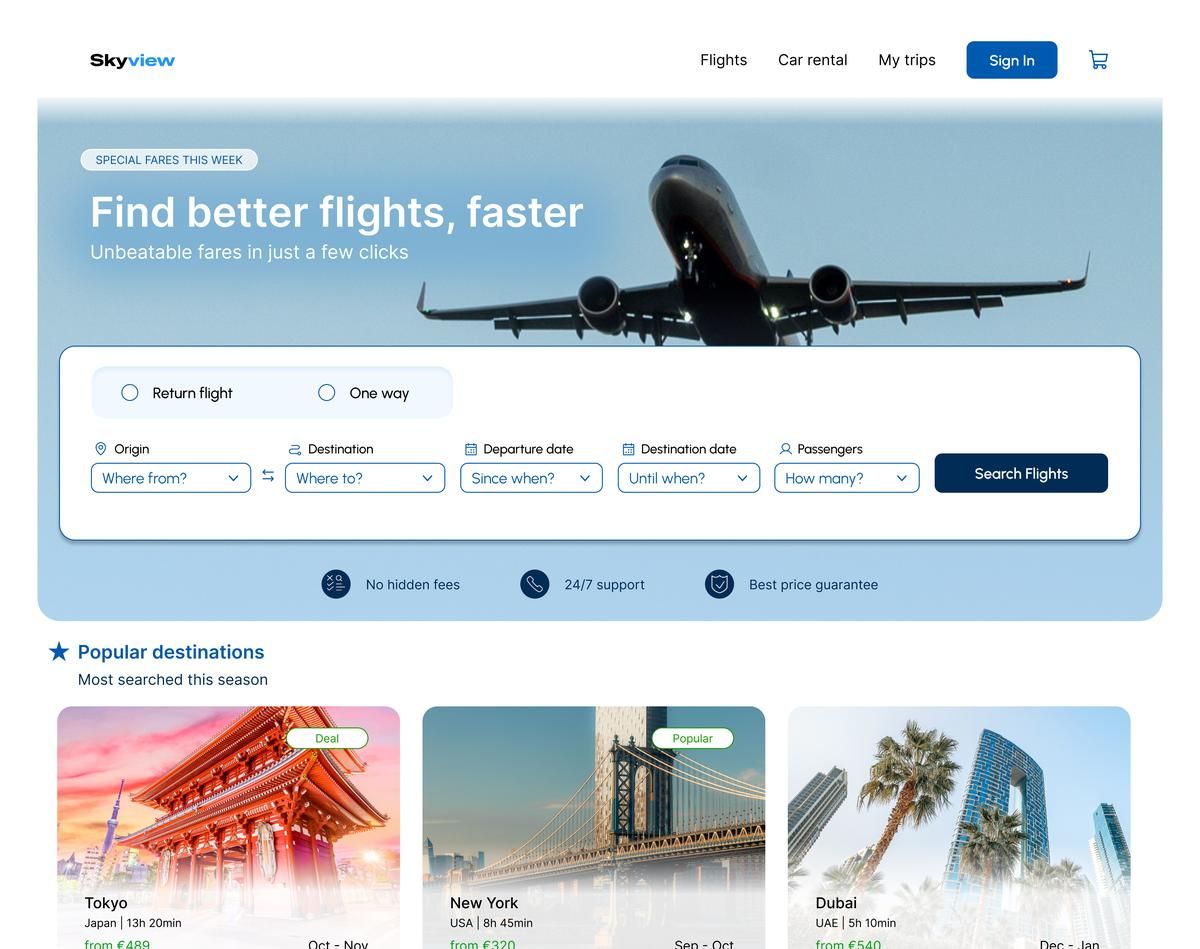
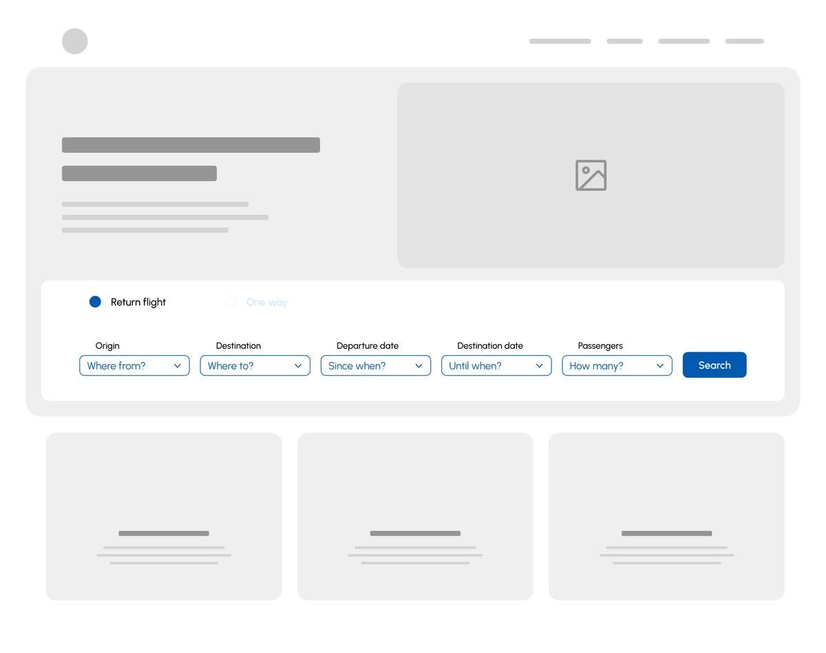
Flight selection
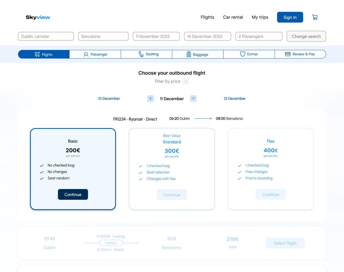
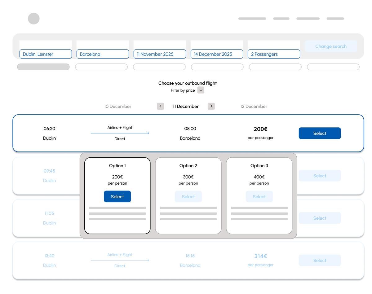
Change: fare tiers renamed (Basic / Standard / Flex) with explicit inclusions shown as checklists. Testing showed users couldn't distinguish tiers by name alone. They needed to see what each included before feeling confident enough to select.
Seat selection
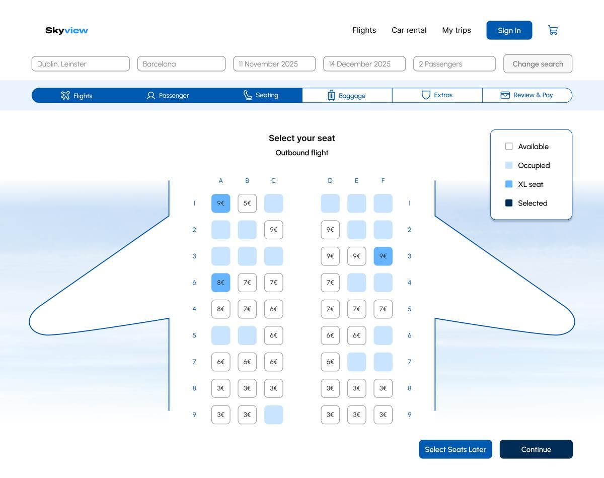
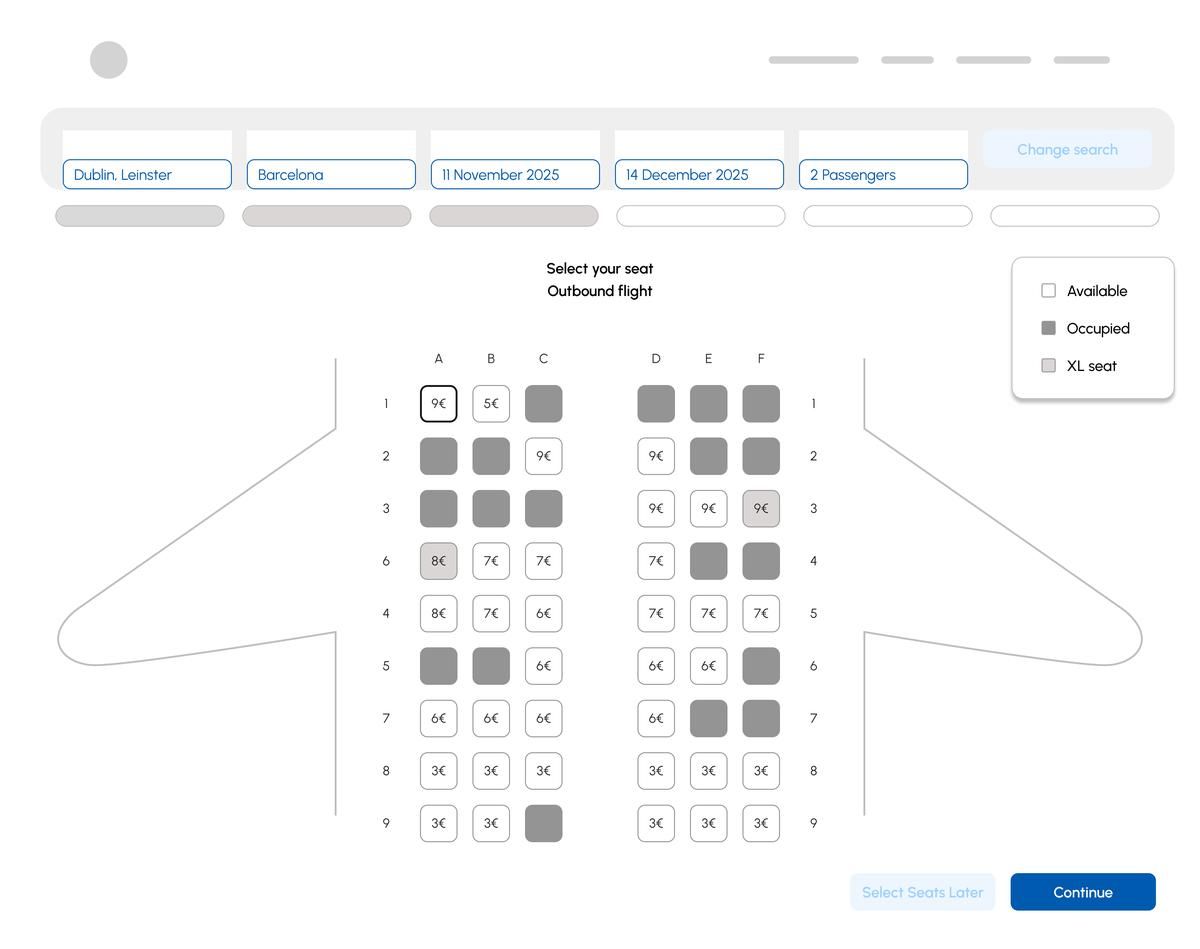
Change: seat states redesigned with a clear 4-item legend (Available / Occupied / XL seat / Selected) and colour-coded cells. X marks and greyed seats without explanation were the top source of confusion in testing. No participant understood them without trial and error.
Baggage
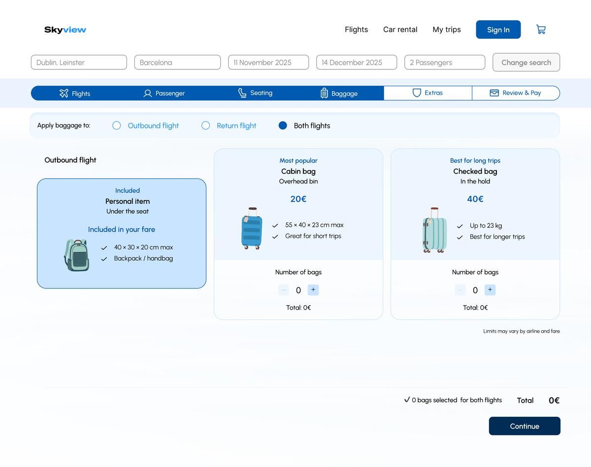
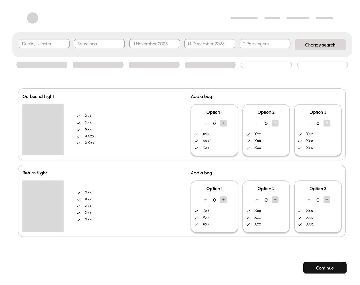
Change: baggage presented as a single "Apply to both flights" toggle rather than two separate selections. Testing found users completing the outbound section and missing the identical return section entirely, resulting in asymmetric baggage they hadn't intended.
Extras
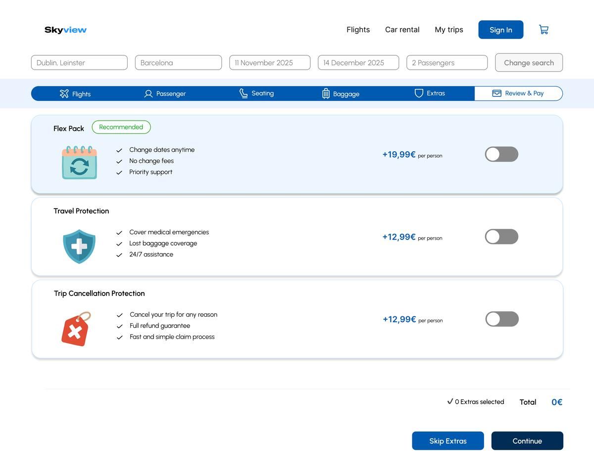
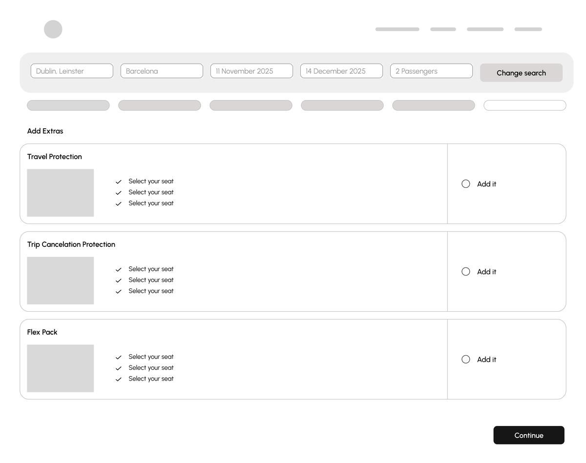
Change: all extras moved to opt-in toggles (off by default) replacing the wireframe's radio button pattern. Pre-selected insurance was the single most-cited trust issue in testing. Participants felt deceived when they noticed it was already checked.
Payment
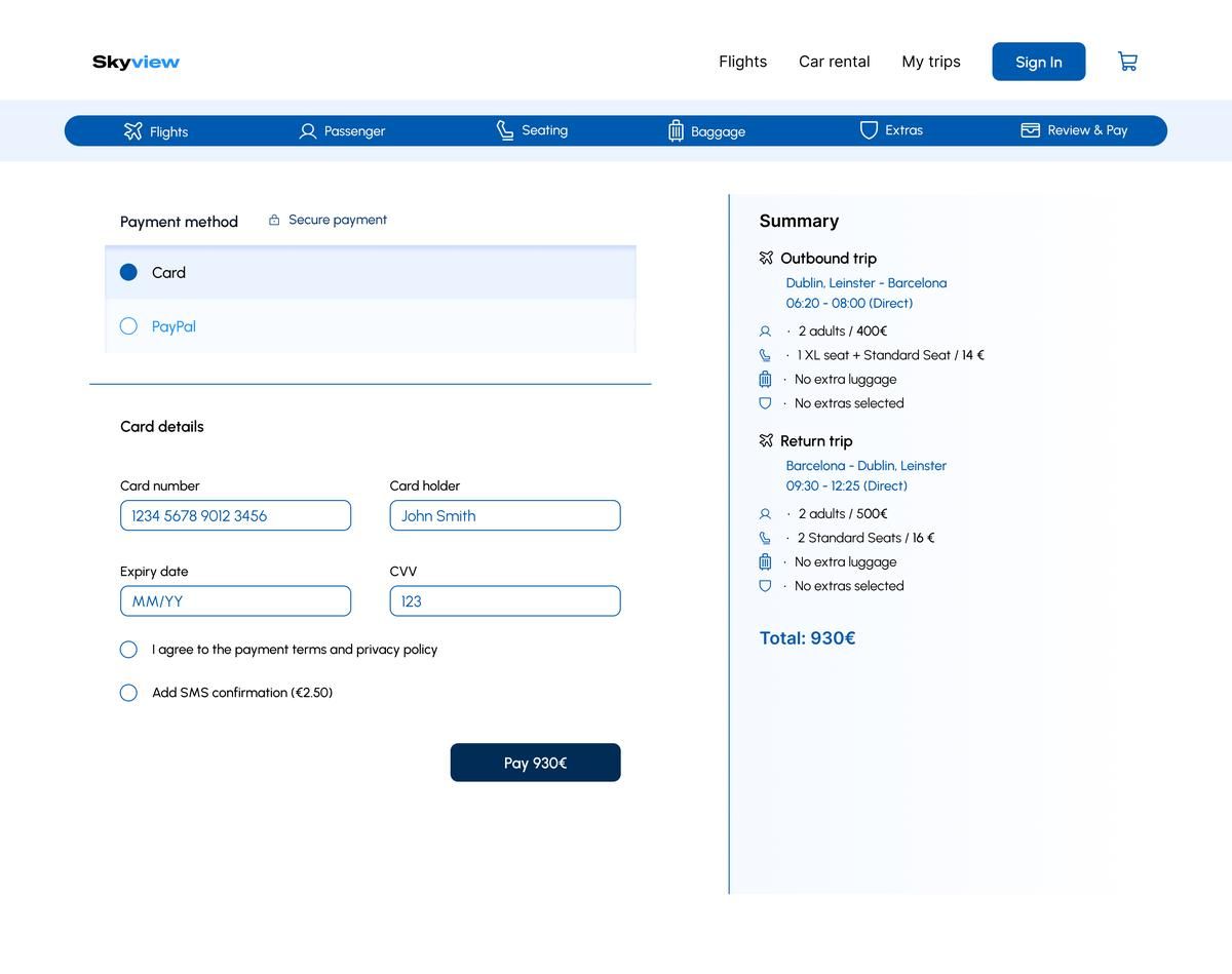
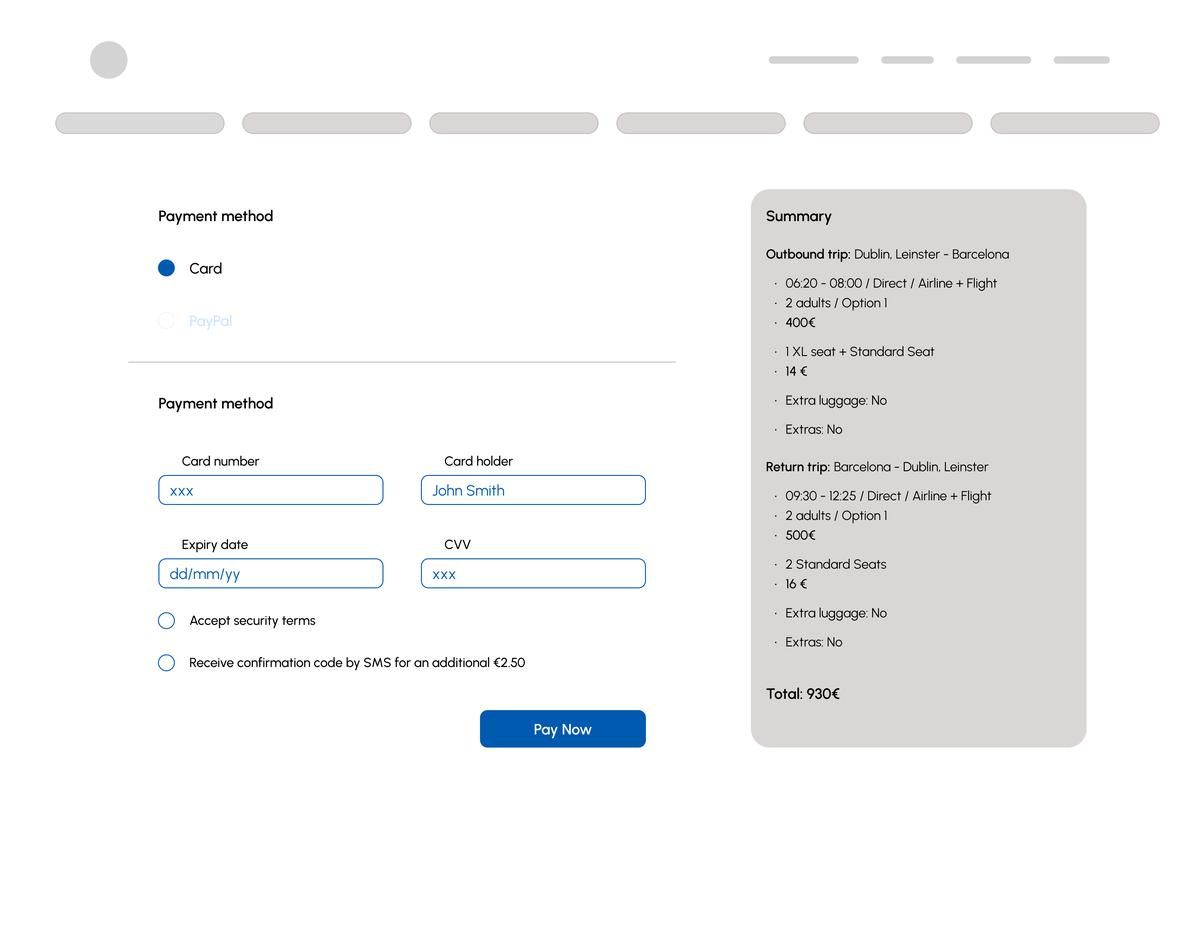
This project reinforced something I consider fundamental in UX: the quality of the design is a direct function of the quality of the research. Every decision in the high-fidelity, the opt-in insurance toggles, the explicit fare tier checklists, the persistent price summary, the redesigned seat state legend, traces back to a specific observation from a specific user in a specific moment of friction. Nothing was designed from assumption.
Running two rounds of usability tests. One on the existing products before sketching, one on the medium-fidelity wireframe before committing to high fidelity, proved its value immediately. The second round surfaced interaction issues that wouldn't have been caught any other way: the seat map transition that caused hesitation, the baggage return leg that users consistently missed, the payment form that prompted repeated scrolling to verify the total. Each of those became a concrete fix rather than a post-launch patch.
The AI-assisted analysis layer added something I hadn't expected: speed without loss of depth. Running sentiment classification and keyword extraction over 180 raw observations in minutes rather than days of manual synthesis, letting me spend more time on the design problems themselves and less on organising data. That's a workflow I'll carry forward.
Every screen in the Figma file includes a dedicated annotation layer for developers. Each note documents spacing values, component states, interaction behaviour, edge cases and copy guidelines, so the team implementing the design has everything they need without needing to guess or ask.
Banking App. UX/UI Design
A mobile banking application designed to make personal finance management clear, engaging and trustworthy. The project covers the full UX/UI process: competitor analysis, reference research, wireframes and high-fidelity screens. Focus on data visualisation, intuitive navigation and user confidence.
Most banking apps treat users as transactions. Balances buried three taps deep, error messages that don't explain what went wrong, transfer flows so ambiguous that people screenshot the confirmation screen just to feel sure the payment went through.
The brief: a mobile banking app for iOS, Android and web. It should make personal finance feel clear at a glance, engaging enough to return to daily and trustworthy enough to hand your financial life to. Target user: 25–40, digitally fluent, managing multiple accounts, wanting control without complexity.
Visual research first. References mapped into three design pillars to lock in direction before touching any components. Then the design system: typography, colour, icons, component library. First screens as medium-fidelity wireframes: structure and flow only, no colour. Two user interviews exposed the friction that mattered. Findings iterated directly into the high-fidelity prototype across mobile, tablet and desktop.
Both users tapped "More actions" expecting a global menu. Not options specific to the account they were on. The label read as site-wide, not contextual.
Renamed "Account options", moved from the top bar to directly below the account card.
Both users looked for the IBAN near the card graphic and didn't find it. It was in an info block to the right. One user screenshot the screen to save the number later.
IBAN moved directly below the card graphic, with a one-tap copy action inline.
Both users completed the transfer but immediately asked "did it go?" The "Make Transfer" button read as a form submit, not a final action. Task completed; confidence wasn't.
Added a confirmation state showing amount, recipient and timestamp before the final action clears the screen.
The bottom tab navigation, card carousel and spending chart all tested without friction. Both users understood them immediately without prompting.
Medium-fidelity wireframes first. Structure and flow, no colour. After user interviews, three specific changes made it into the high-fidelity: Account options label and position, IBAN placement on the card-detail screen and a dedicated transfer confirmation state. Switch breakpoints with the device selector; toggle wireframe vs final to see the difference.
Before wireframes, I analysed existing banking apps to identify patterns, visual language and interaction models that resonate with users. The references are grouped into three design pillars. Clear, Playful and Trustworthy. Each representing a different design direction and emotional register. These three dimensions become the foundation of the final visual identity.
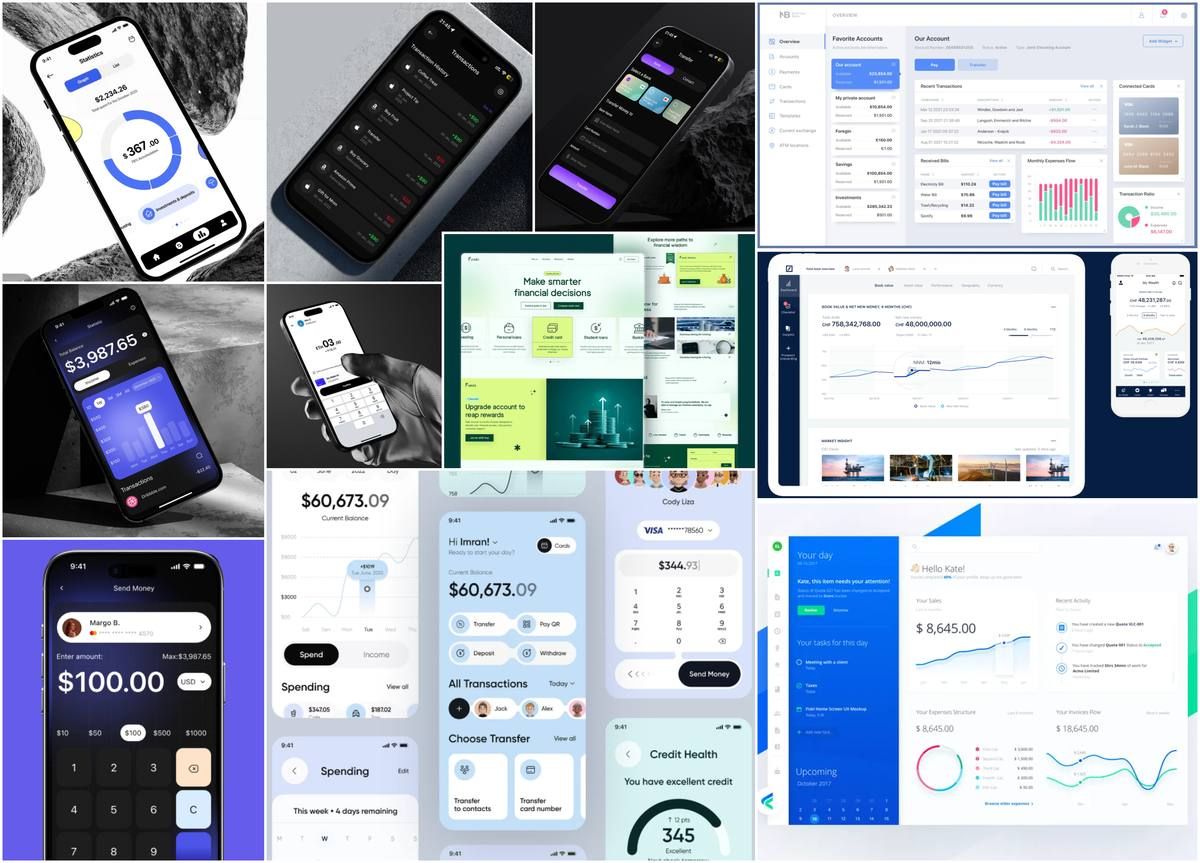
- Circular charts give visual weight to the main balance.
- Red/green conventions for income and expenses.
- Merchant icons make transaction lists scannable.
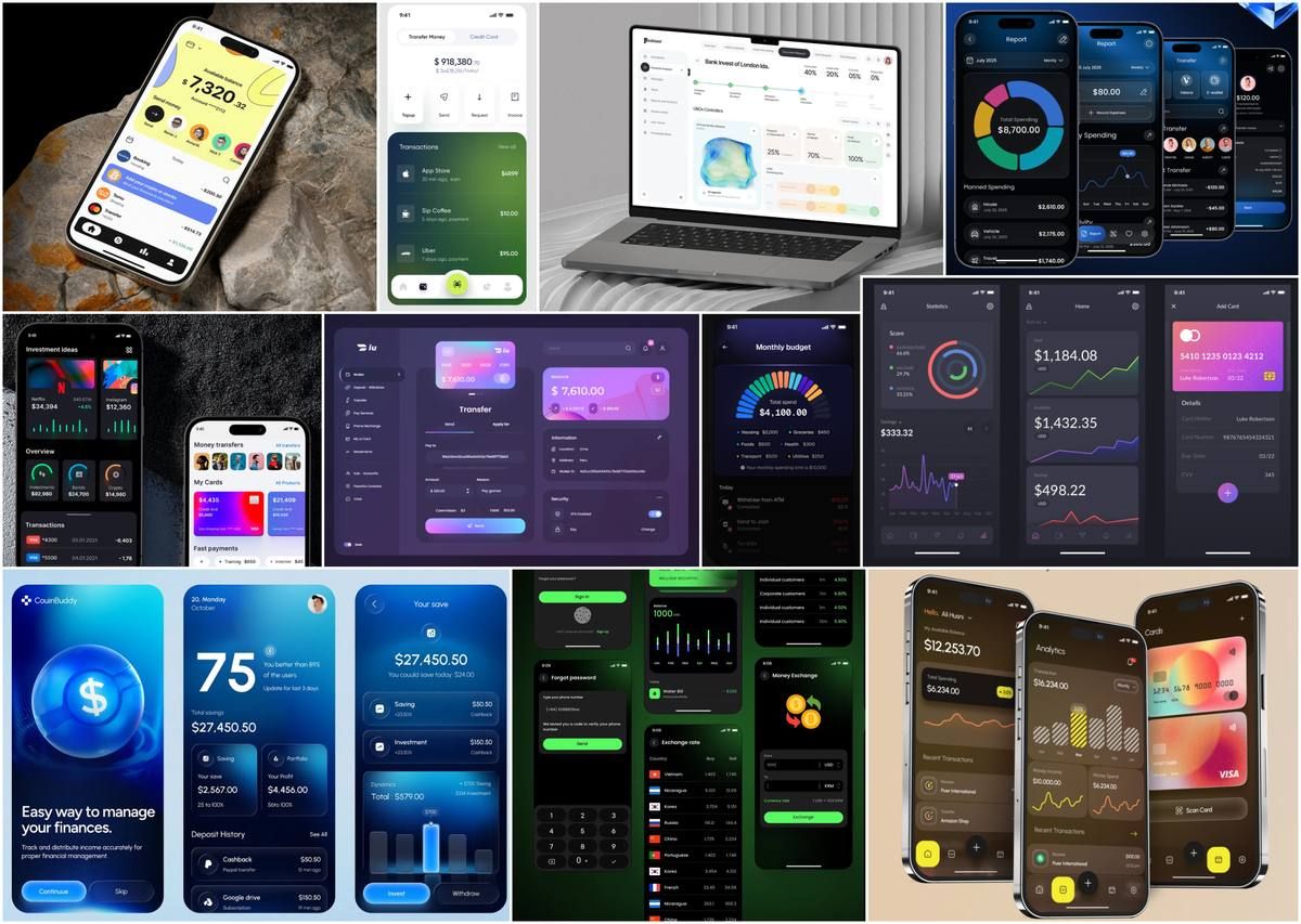
- Colour as a coding system; accent on dark backgrounds.
- Side menu + horizontal bar cover different navigation modes.
- Card shown graphically during transfers.
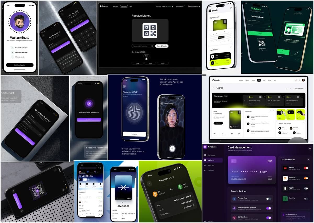
- Email/phone + verification code signals security from sign-in.
- Face ID and fingerprint protect without adding friction.
- Partial card numbers shown by default. Privacy by design.
Before moving into wireframes, I defined the layout grid that structures the app across the three main breakpoints: Mobile, Tablet and Desktop. Each grid follows an 8px base unit and is built directly in Figma using rows, columns and a background grid overlay to ensure spatial consistency throughout the design process.
All three breakpoints share the same 8px base unit and the same stretch column type, ensuring proportional scaling from mobile to desktop. Margins and gutters increase progressively (16 → 32 → 64px) to give content more breathing room on larger screens, while the column count scales from 4 → 8 → 12 to support richer layouts at wider viewports.
Before designing a single component, I studied what works and why, across fintech apps that handle trust well. One concrete outcome: the bottom tab pattern came from Revolut and Monzo, both of which keep persistent navigation visible at all times rather than hiding it behind a hamburger. In a banking context, always-visible navigation reduces anxiety. Users know where they are and how to get out. That's a trustworthy pattern, not just a usable one.
Bottom tabs, persistent headers and breadcrumb hierarchies studied across fintech and banking apps to ensure familiar wayfinding.
Field labels, validation states and input affordances drawn from systems that prioritise legibility and trust in sensitive data entry.
Primary, secondary and ghost button hierarchies referenced to define clear action priority without visual noise on dense screens.
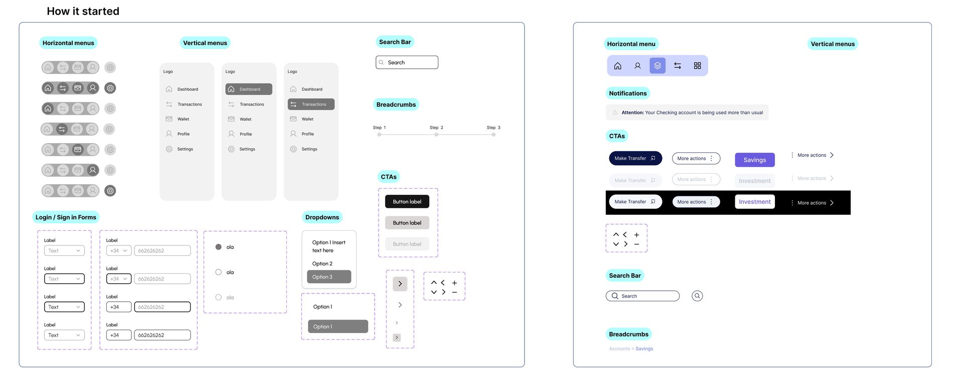
Design note. Each reference was evaluated against the three Moodboard pillars: does it feel Clear enough to build trust at a glance? Does it carry a sense of Playfulness without undermining the seriousness of banking? And does it feel Trustworthy: the kind of product a user would hand their financial life to?
Inter was chosen for its exceptional legibility at small sizes, optical balance across weights and widespread adoption in financial interfaces. The scale follows a deliberate hierarchy: large sizes anchor screen titles, mid-range styles handle data and metrics, lighter weights carry labels, captions and legal copy. All calibrated across Mobile, Tablet and Desktop breakpoints.
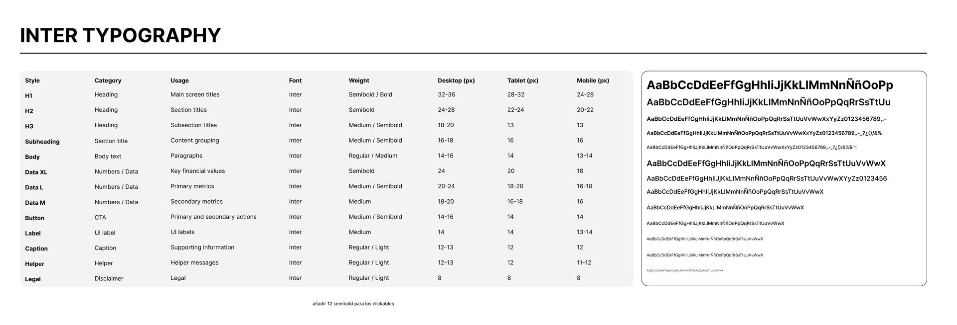
Design note. Data-specific styles (Data XL, Data L, Data M) are defined separately from heading and body styles. They handle the precise spacing requirements of financial figures: account balances, transaction amounts and metric dashboards, where character width consistency matters as much as visual hierarchy.
The palette is built around a deep navy core that signals authority and trust, expanded through purple-blue tints for the brand's digital-native energy. A structured neutral ramp handles all UI surfaces. Three semantic colours appear only as feedback signals, never decoratively.
A custom set of 55 icons designed for Boyal's interface. Each icon follows a consistent grid with uniform stroke weight, covering navigation, actions, financial operations and system feedback. Visual coherence across every screen.
 Add
Add
 Approvals
 Benefits
 Bottom
 Business
 Charts
 Close
Close
 Delete
 Documents
 Download
 Enable–Disable
 Expand
 Export
 Favorites
 Filter
 Graphics
 Help
Help
 Information
 Investments
 Language
 Left
Left
 Link
Link
 Location
 Log out
 Menu
Menu
 Messages-1
 Messages
 Minus
Minus
 Notification-1
 Notification-2
 Overview
 Payments
 Plus
Plus
 Products
 Profile
 Refresh
 Right
Right
 Route
Route
 Savings
 Scan
Scan
 Search
 Send Money
 Settings
 Share
Share
 Sign In
 Sync
Sync
 Top Up
 Top
Top
 Transfers
 Undo
Undo
 Wallet
 Warning
 Withdraw
 home
home
The three design pillars became a shared language. Every component decision could be traced back to Clear, Playful or Trustworthy. More useful than I expected: it made tradeoffs easier to discuss and kept the system coherent across two months of iteration.
The most revealing moment came from the transfer confirmation test. Both users completed the task. They immediately asked "did it go?" The wireframe had no issue. Task completion and user confidence aren't the same metric. Two interviews surfaced something a solo review would have missed.
What I'd do next: empty states. The spending chart with no transactions, the account list before any cards are added, the notification panel with nothing to show. These are the screens most case studies skip. They reveal whether the designer has thought through the full system, not just the happy path.
Motion
L'Oréal — Digital Assets & Motion Production
Embedded at Craft/McCann within L'Oréal Group — with a focus on the Luxe division and flagship brands such as Lancôme, YSL and Prada. Automated high-volume social content pipelines, collaborated directly with brand head managers on campaign creative and served as a versatile production partner across the full portfolio.
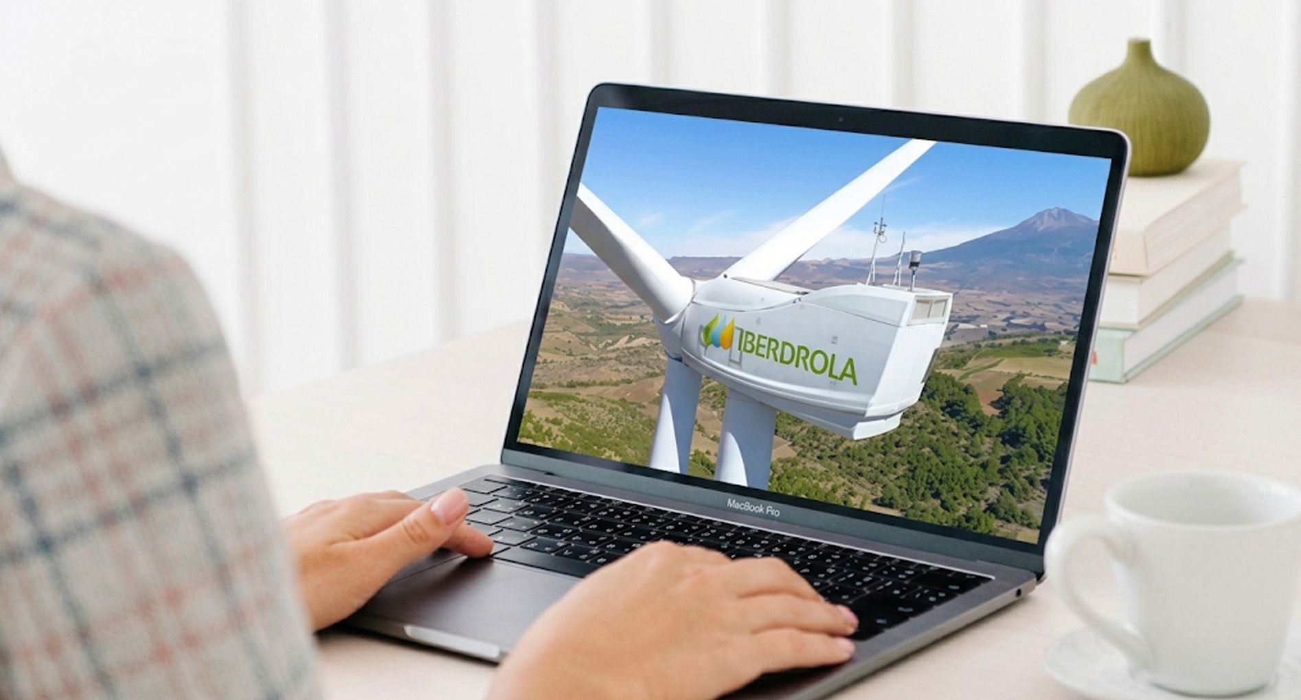
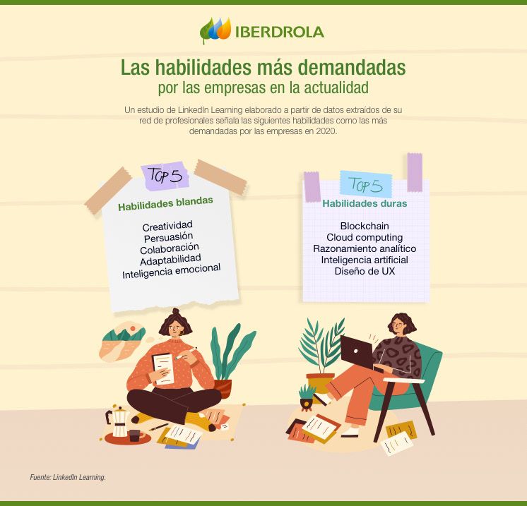
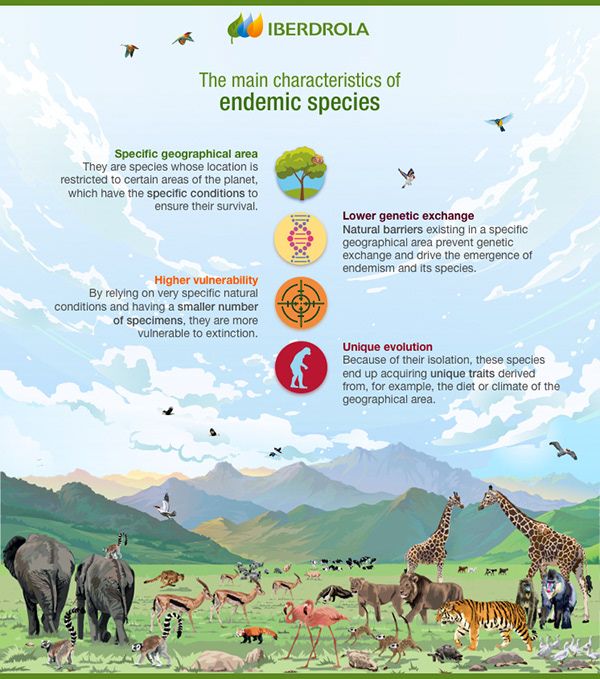
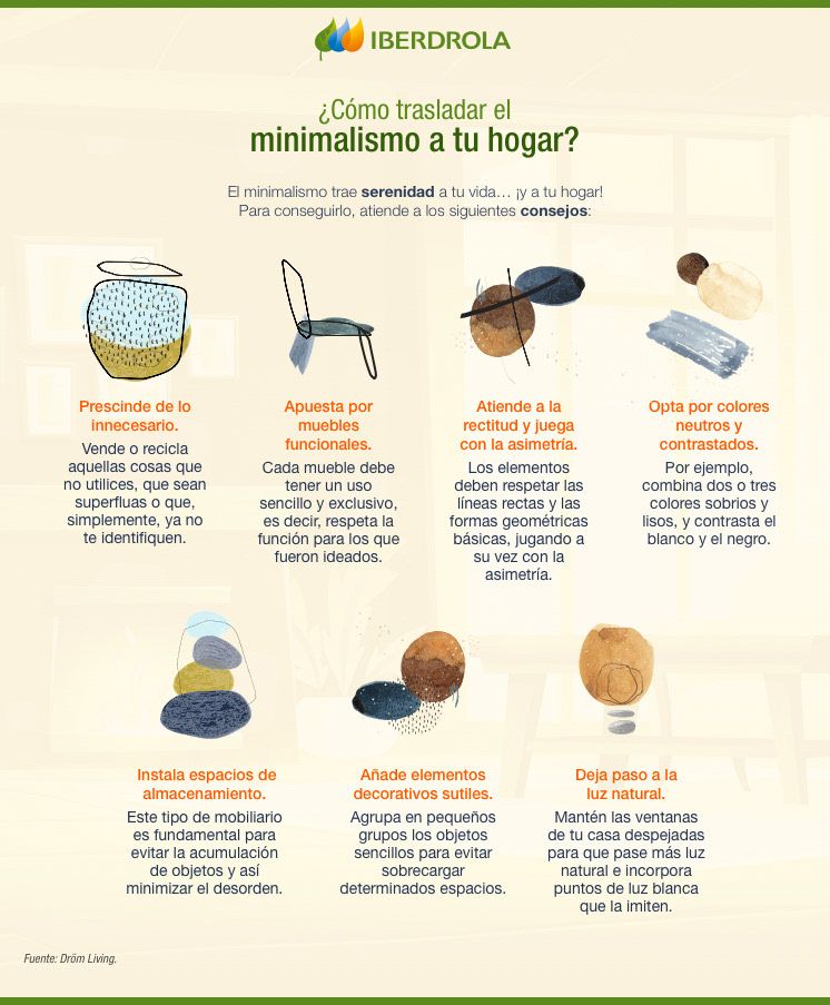
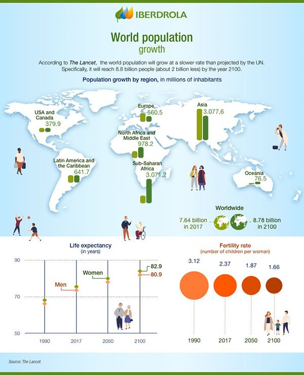
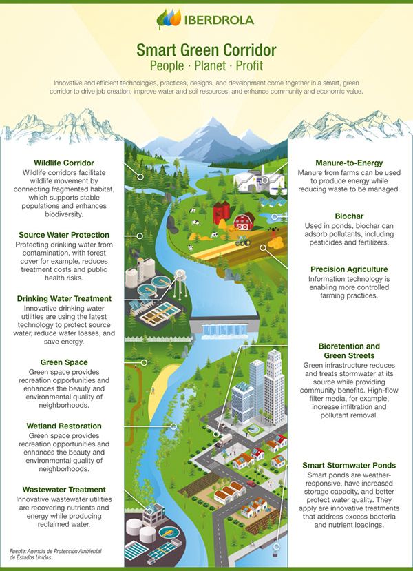
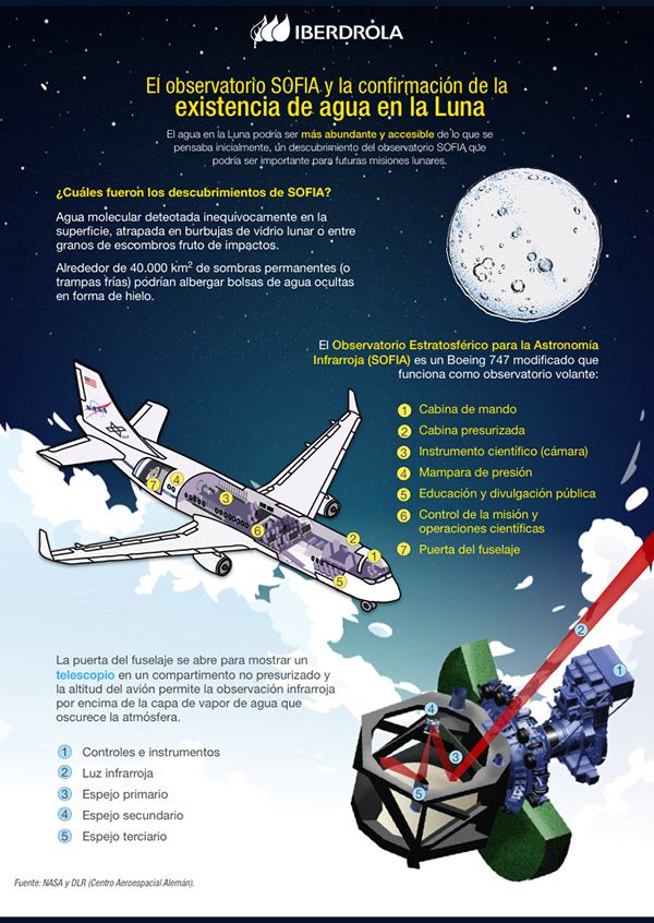
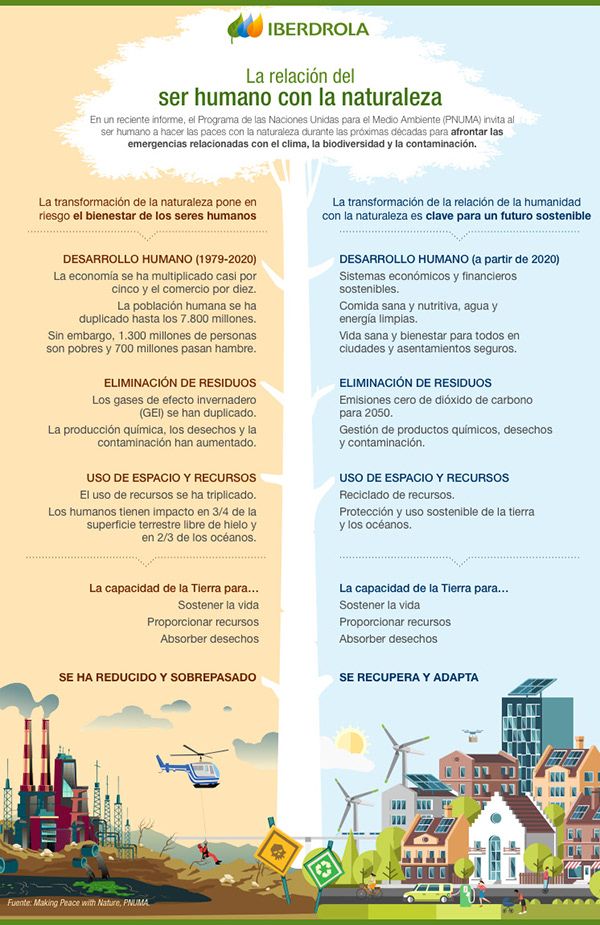
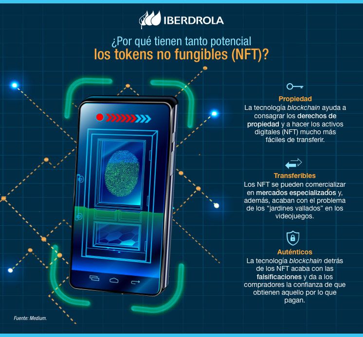
Iberdrola — Corporate Communication
Design and production of corporate newsletters and infographics for Iberdrola's internal and external communication campaigns, with a focus on visual clarity and brand consistency.
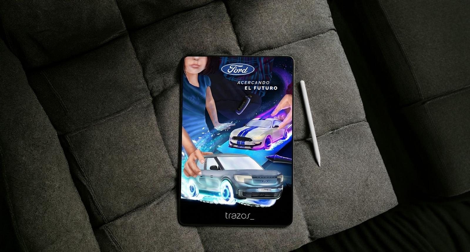
Ford — Bringing the Future Closer
Poster and digital illustration for Ford's Acercando el Futuro campaign. A concept built on family, play and the emotional connection between generations.

Artichoke — Brand Identity Design
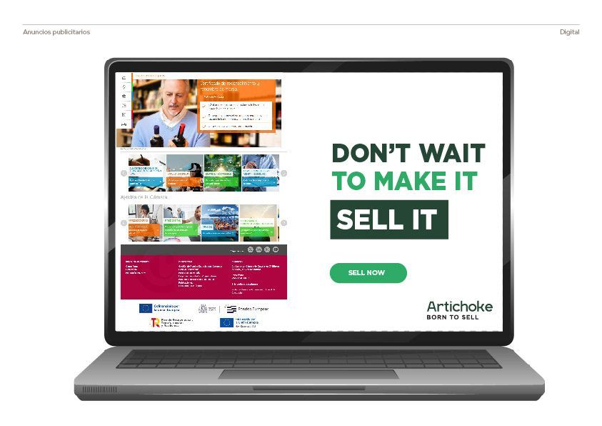
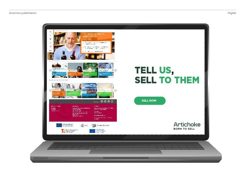
Brand identity for a Florida-based marketing agency specialising in sales acceleration and purchase intent data.
Digital Assets & Motion Production
Part of the founding team at Craft/McCann that landed and built the L'Oréal Group digital production account across Spain, Portugal and the Nordic markets. As the account grew, so did the team. The work spanned all four divisions: Consumer Products (L'Oréal Paris, Maybelline, Garnier, NYX and Essie), Luxe (Lancôme, YSL Beauté, Armani Beauty, Prada Beauty, Valentino Beauty, Kiehl's, Mugler, Diesel, Viktor&Rolf and Cacharel), Dermatological Beauty (La Roche-Posay, Vichy and CeraVe) and Professional Products (L'Oréal Professionnel, Kérastase and Redken). Handling between 7 and 10 live projects at any given time, I built Figma and Photoshop automations to keep output high without losing quality, while working directly with head managers on campaign briefs and creative direction.
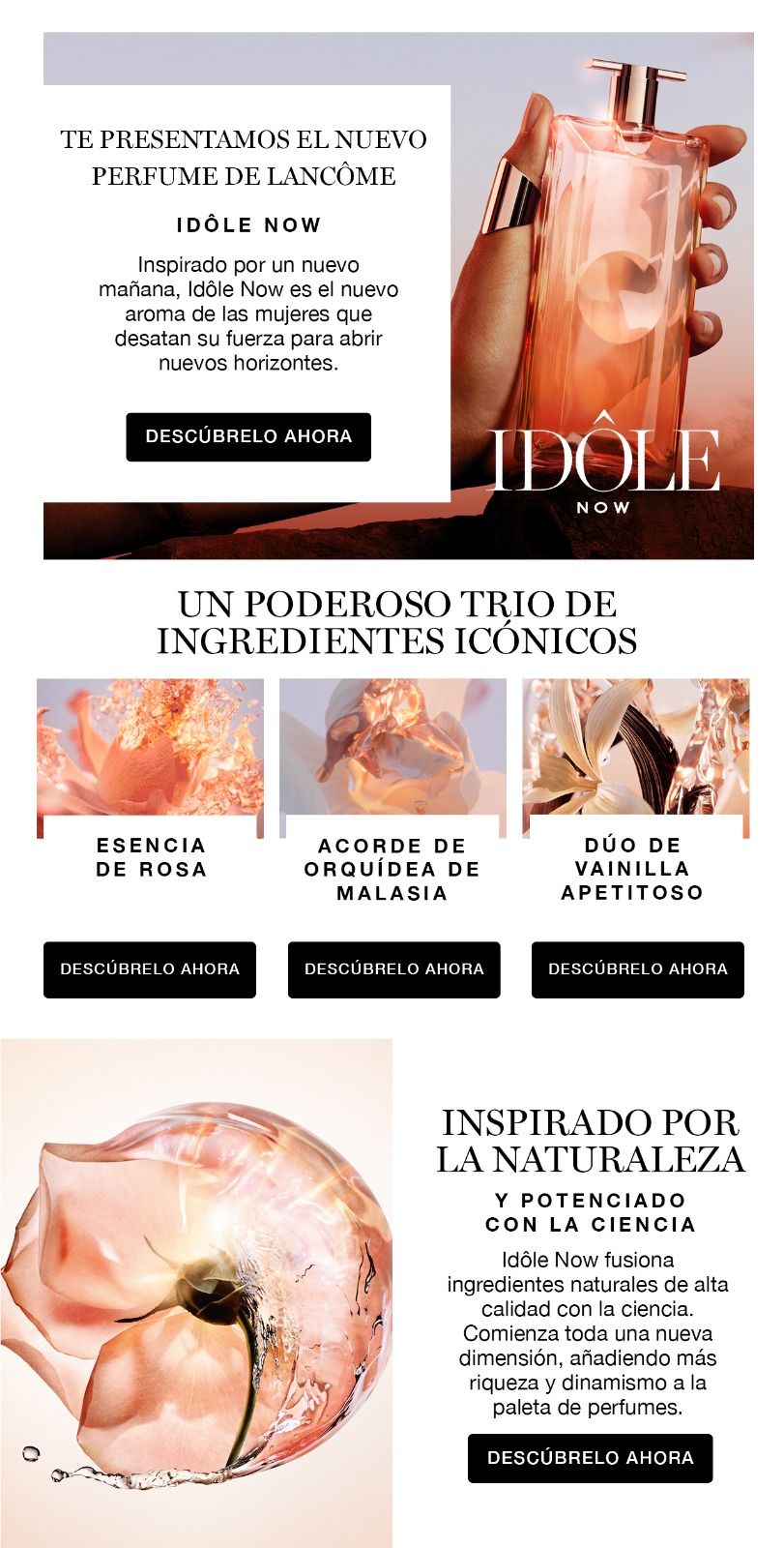
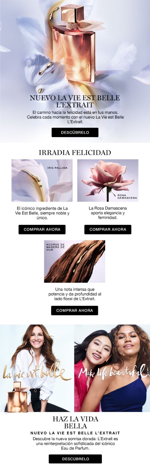
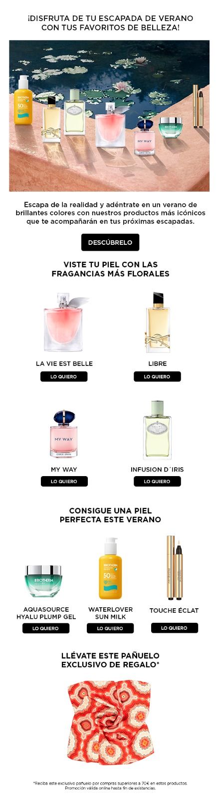
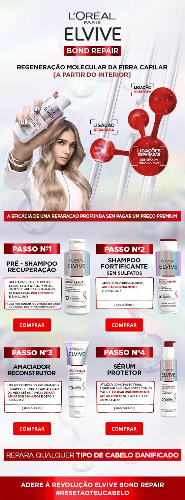
Email campaigns built for multiple brands simultaneously, each with its own visual language, hierarchy and tone. Layouts optimised for rendering across major email clients.
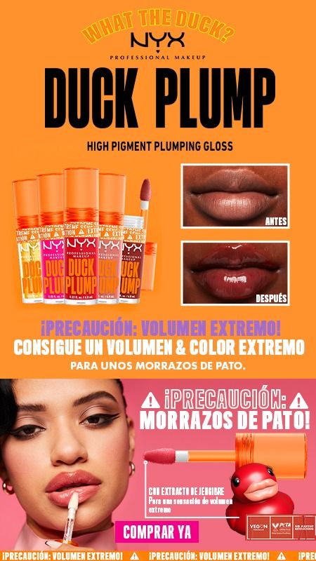

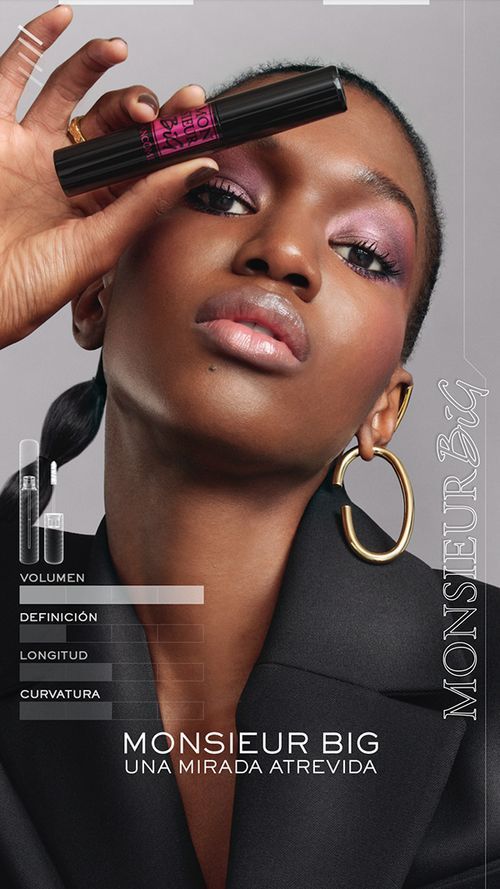
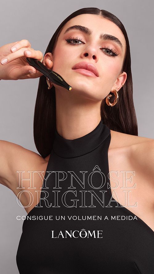
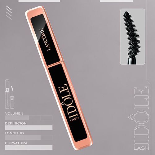
Motion edits, animated banners and video adaptations produced for paid media and social across L'Oréal Group brands. Tap any frame to play.
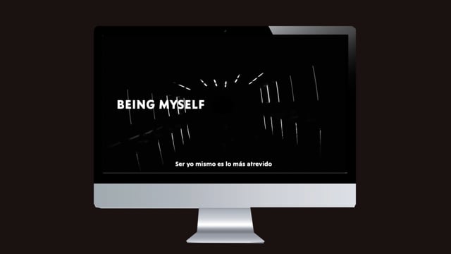
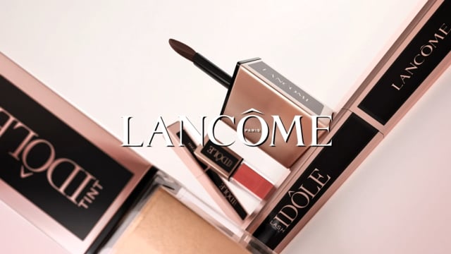
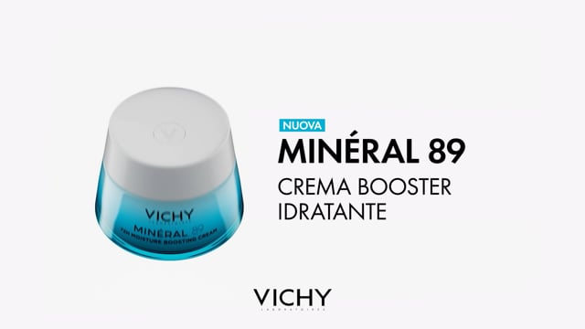
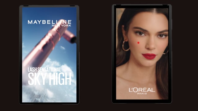
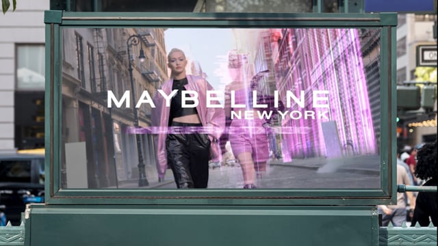
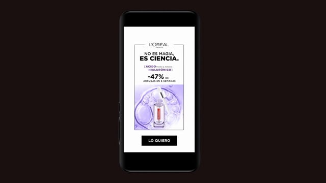
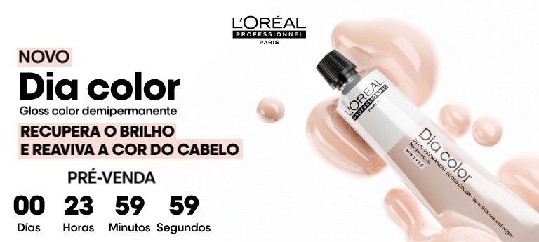
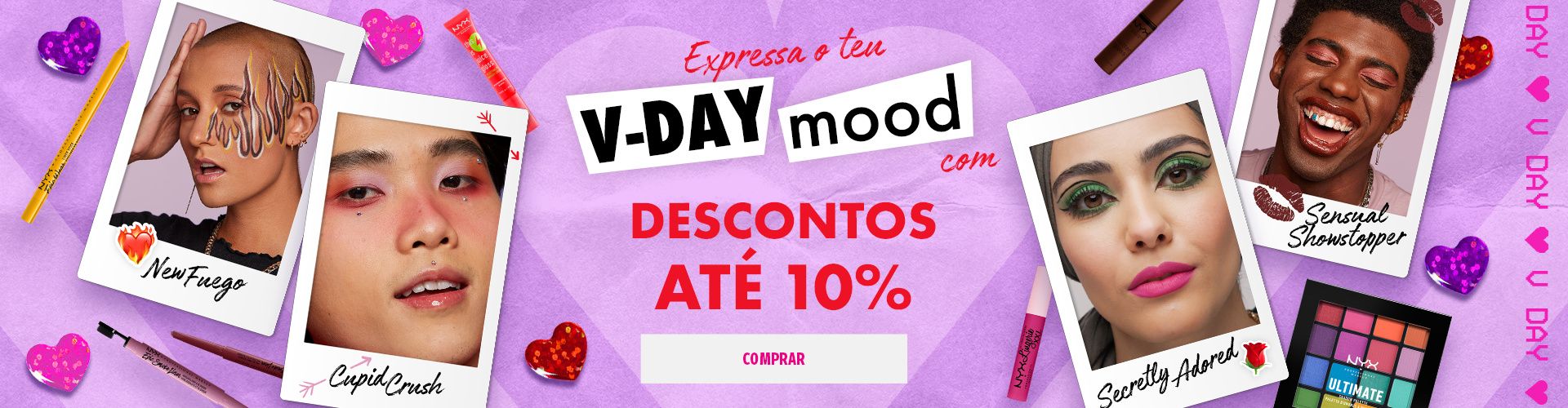
Static and animated display banners produced across multiple L'Oréal Group brands. Formats adapted for digital display networks and e-commerce placements.
 ▶ GIF
▶ GIF
 ▶ GIF
▶ GIF
 ▶ GIF
▶ GIF
 ▶ GIF
▶ GIF
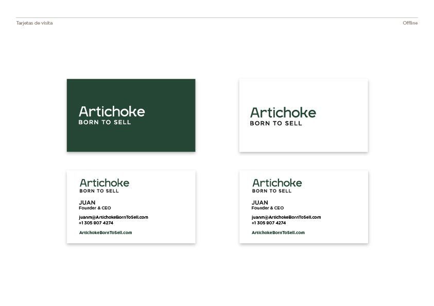
Artichoke — Born to Sell
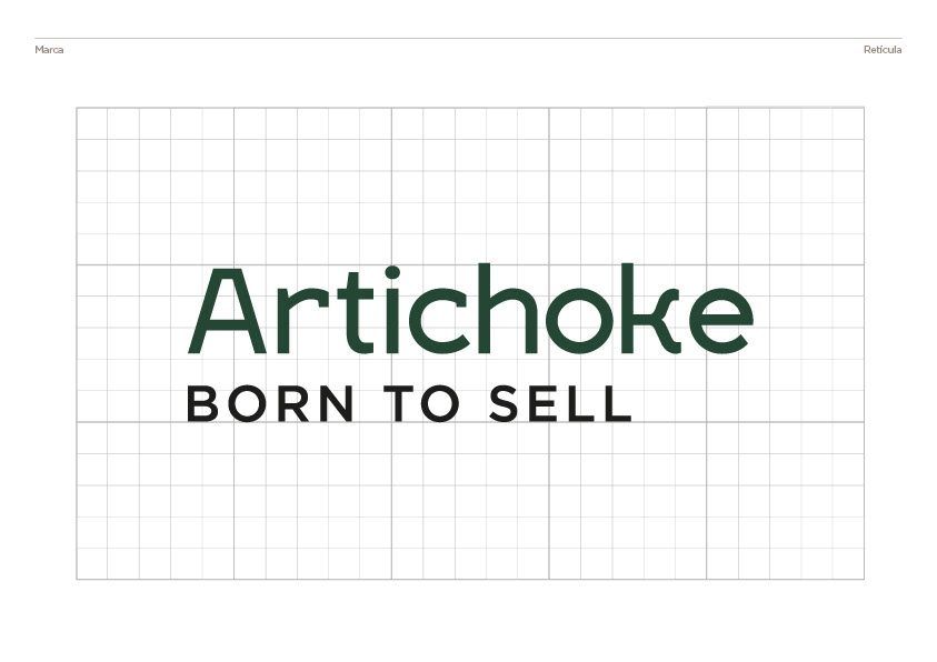
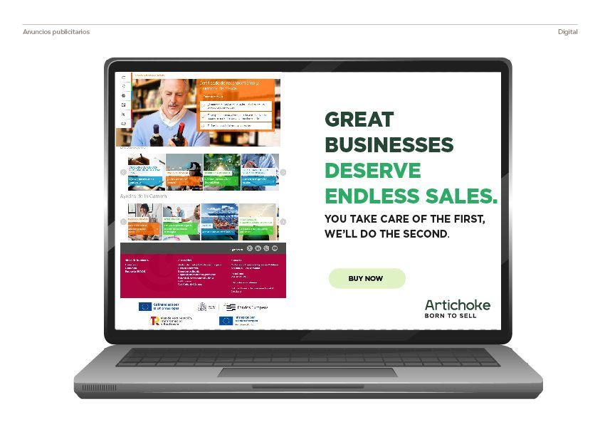
Artichoke Born to Sell is a marketing agency based in Coral Gables, Florida, specialising in helping sales teams identify and convert leads through purchase intent data and tracking technologies. Their philosophy is direct: sell more in less time, leveraging first-party data to sharpen and optimise every step of the commercial process.
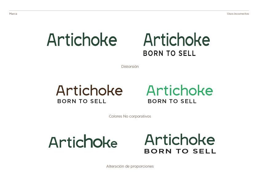
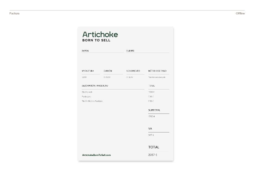
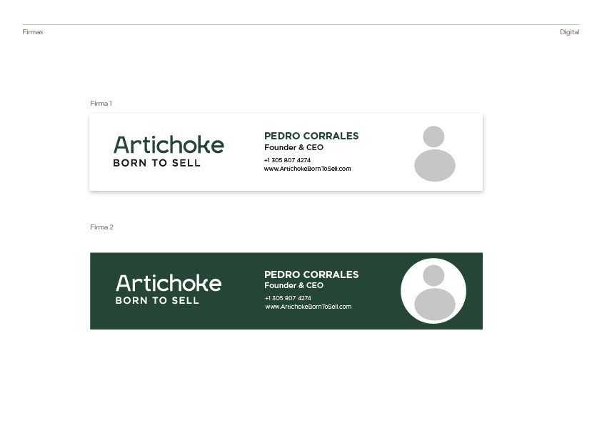
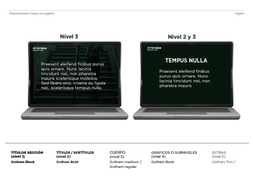
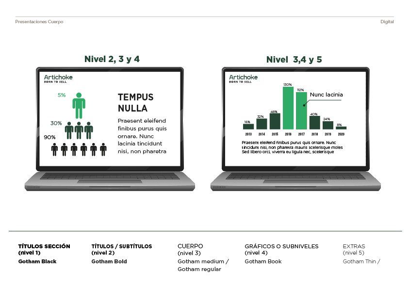
I was brought in to build their brand identity from the ground up, from naming logic and visual concept through to logo, typography, colour system and brand guidelines. The challenge was translating a very performance-driven, data-first culture into a visual language that felt sharp and confident without losing approachability. The result is an identity built around clarity, precision and forward momentum.
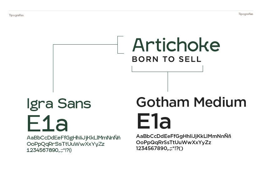
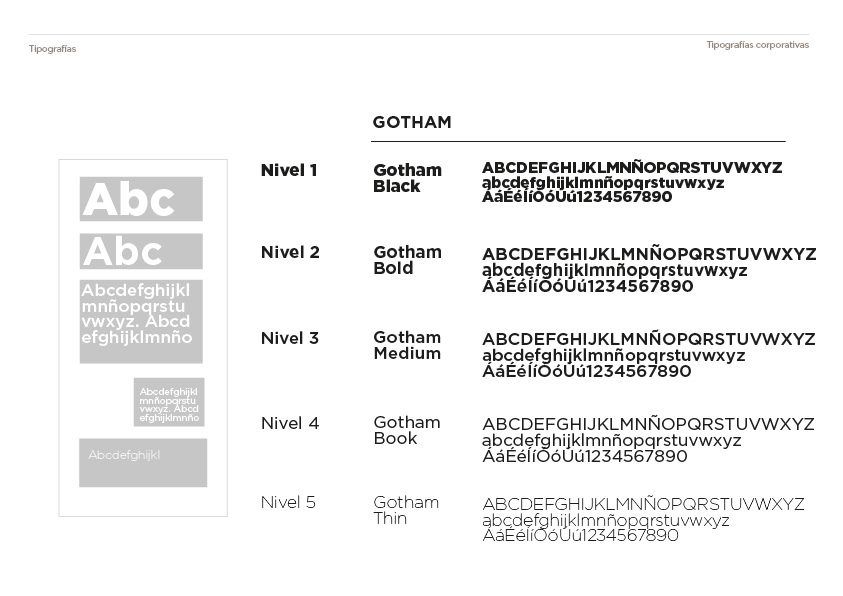
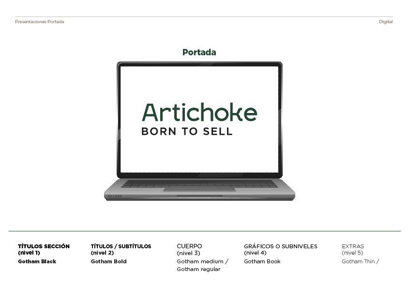
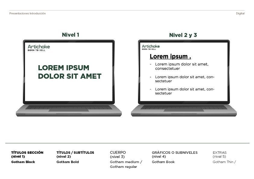
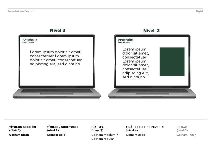
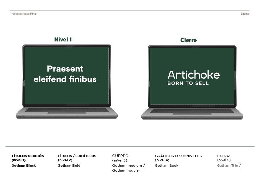
The logo uses Igra Sans and Gotham Medium. For all other text across the brand, headlines, body copy, data labels and captions, the complete Gotham family is used.
Ford — Bringing the Future Closer
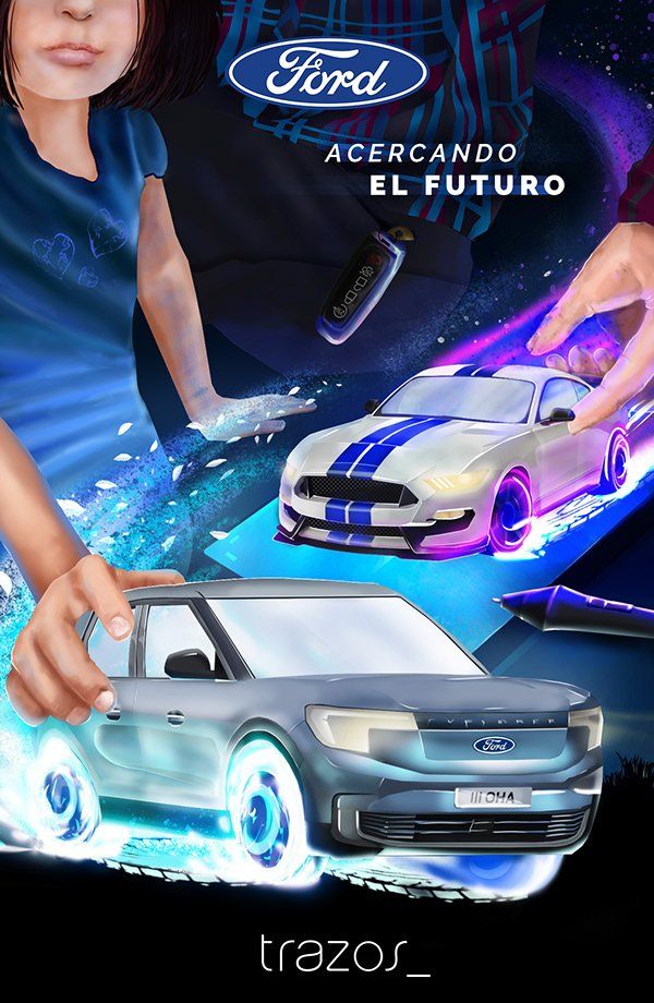
A poster for Ford built around the campaign line Acercando el Futuro. Bringing the Future Closer. Rather than a direct product message, the concept took an emotional route: a father playing toy cars with his daughter. A small, familiar scene that carries a much larger idea.
The image works on two levels. On the surface, it's about play. A shared moment, a Ford in miniature, a connection between generations. Underneath, it's about the act of guiding someone until they find their own path. The same way Ford has accompanied families for decades, quietly present at every milestone, until the next generation gets behind the wheel on their own terms.
This dual reading brings the brand closer to new audiences, not through specs or performance, but through belonging, memory and the kind of trust that's built over time.
Speed painting and composition process.
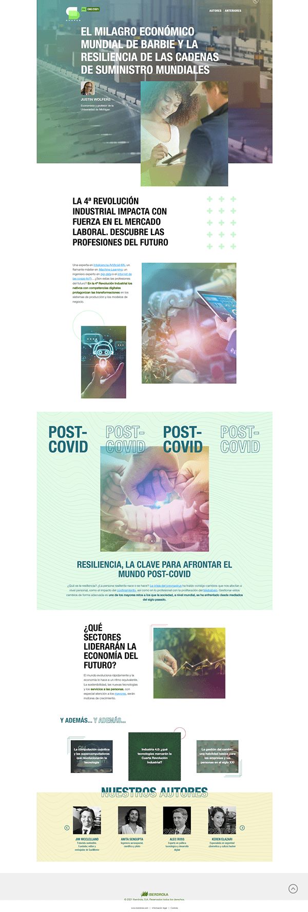
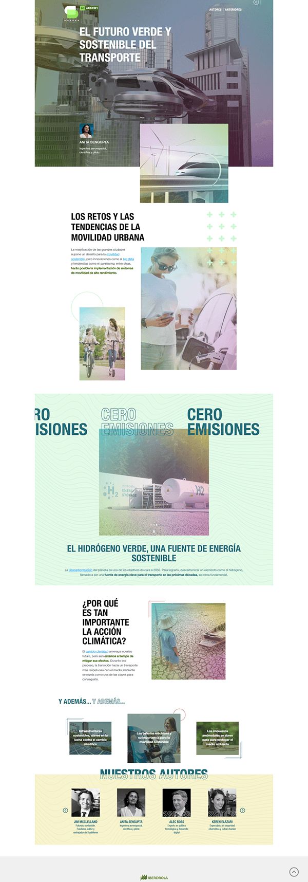
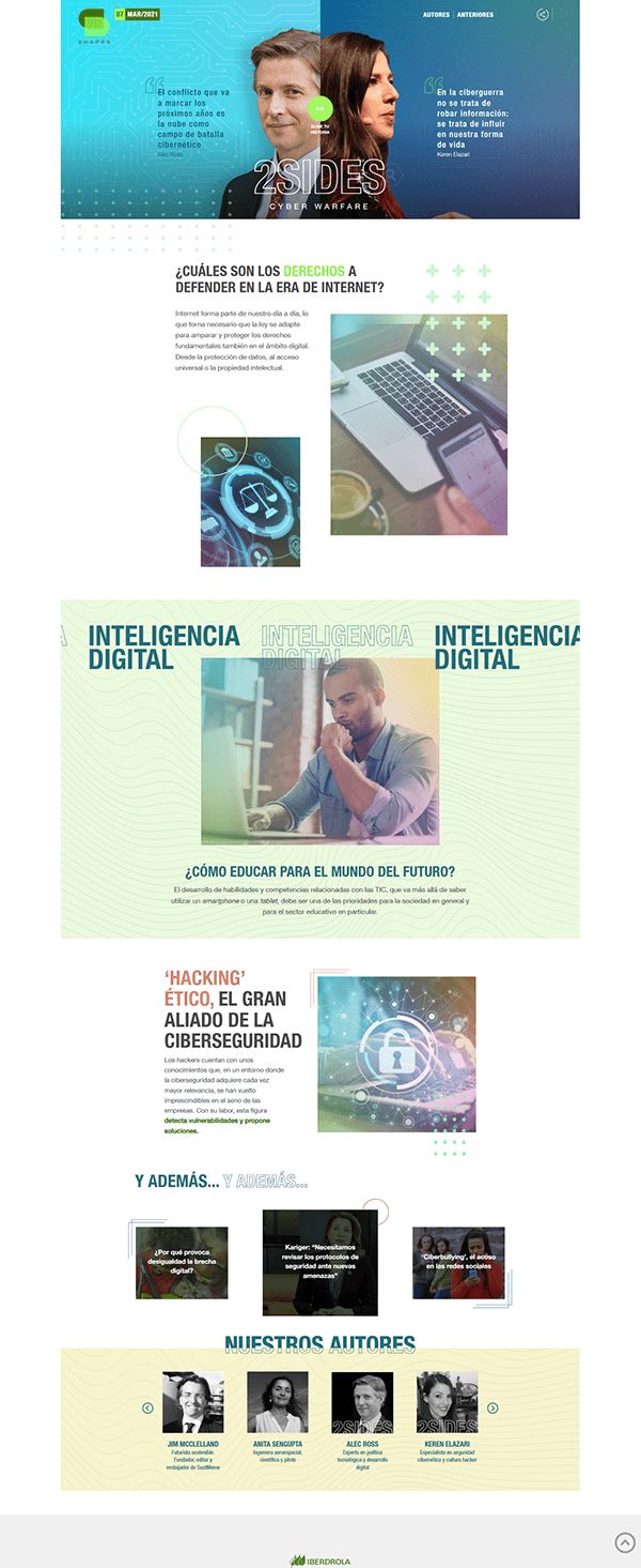
Iberdrola
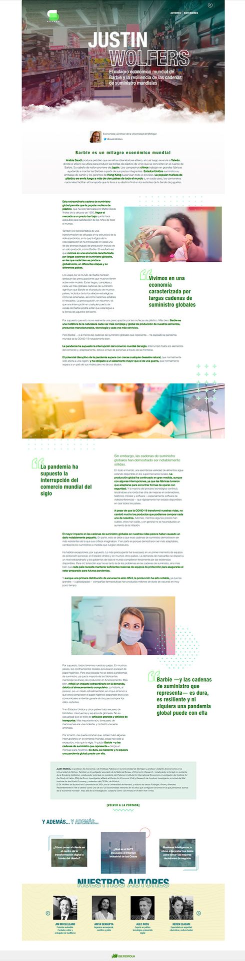
At MRM/McCann I worked on Iberdrola's corporate communications across multiple formats and deliverables. This included the end-to-end production of Shapes, a monthly digital magazine on energy, sustainability and technology, as well as data-driven infographics, visual storytelling pieces and the design and layout of special campaign editions tied to key brand moments. Every piece demanded a high level of editorial craft, rigorous brand consistency and the ability to translate complex information into clear, engaging visual narratives.
Design and layout of monthly newsletters for Shapes. Click any issue to see it in full.

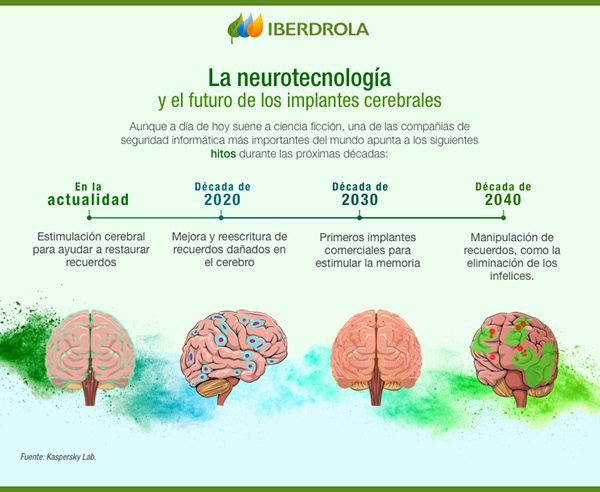
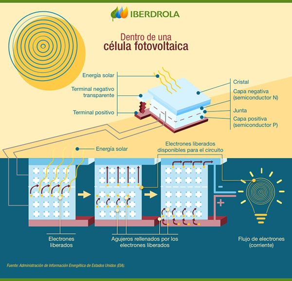
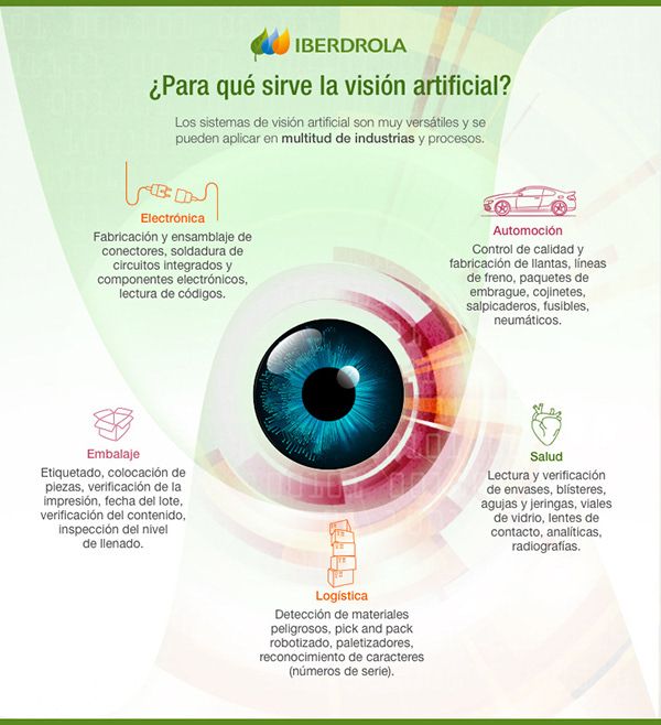
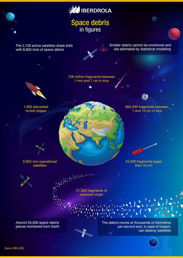
Weekly infographics produced for Iberdrola covering energy, science, sustainability and technology. Click any piece to expand it.